| /Home /Professional /Papers /Settings |
Contents |
IntroductionThis is primarily a simple how-to for a specific problem. I will however delve into technical information behind the scenes. Some of it will be necessary to select the proper parameters. Some will be useful to understand what is happening. Some will be additional technical information for the inquisitive. More will be deep technical and non-technical background. This information is directed primarily for users of the Microsoft Windows Operating System Version 7. Details may vary from Windows XP but the basics remain the same. Windows Version 8 has changed things drastically. When I use the term visually impaired, I do not mean people with major, serious vision problems. I am primarily addressing those like myself who are no longer twenty or thirty-something and probably won't ever see 50 again. We just can't comfortably see and read 8 point font. Even Microsoft is slowly moving to 9 point font but for me 10 point is a minimum and 12 point is even better. The start of the specific problem is located by selecting the "Start" menu and "Control Panel". Hopefully you get the view that shows "All Control Panel Items". If not, select 'View by:", "Large icons" or "Small icons", if you dare. You can also select "Appearance and Personalization" from the "Category" Control Panel. We will be primarily looking at the "Display" and "Personalization" items in the list of options provided. I assume you have some skill with using your computer. If I have lost you at this point, you need some other book or person to start you off in using your computer. Even if you are already lost you can keep reading and soak up some information. It will come back to you and be helpful in the future. Some people may require a second or third reading to get a complete understanding of this information. |
PerformanceI want raw performance from my computer and I dislike artsy animations and cutesy graphics. I want square windows and simple colors. They draw faster and don't slow my computer down. If you like all the nonsense, good for you. If you don't, then here is how to get rid of it.
|
Display OptionsThere is only one decision on the "Display" window. Our target is going to be a display that approximates 12 point font reading size. I am assuming that you have the correct drivers installed for your video card and the proper resolution is automatically selected. Most computers come with the correct drivers installed. If you need help with this complex topic, you need some other book or person to assist you. You can certainly just try a few settings and pick the one you like the most for whatever reason. You might even end up with the same settings I will suggest. I am assuming that because you are reading this information, you want to have a good rationale for your choices. You may not agree with my suggestions but you will have some information on which to base your own choices. The size of your monitor is a significant factor in what you select. The ideal monitor is 23 inches with a resolution of 1920 x 1080. "Medium - 125%" is generally appropriate. If you are lucky enough to have a 27 inch or larger monitor then "Smaller - 100% (default)" is appropriate. If your monitor is smaller than 23 inches or you have very poor eyesight you may wish to choose "Larger - 150%". (Geek area warning. Proceed at your own risk.) The following table illustrates the typical resolution and DPI of some monitors.
(End of Geek warning area.) You might wish to select "Adjust ClearType text" and try some different settings. I dislike ClearType so I turn it off. I observe that it changes the colors of the text and makes it fuzzy to me. You may see things differently. Don't let the sample text on the "ClearType Text Tuner" window throw you off. They have deliberately made the text look bad when you turn off ClearType. |
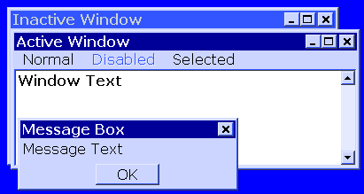
Personalization OptionsYou might choose to "Change mouse pointers". The default pointer is very small. I have created a pointer that is much large and clearer to see. You can download ABigPointer.cur, save it on your computer, and use it for your "Normal Select" pointer with the "Browse" option. You may choose to disable pointer shadow, which I find just makes things fuzzy.The first change I make is to select square windows and simple colors. They draw faster and don't slow my computer down. Windows 10 has severely curtailed these options.
I have included a link to GIF-100.themepack that allows you to instantly choose the options I use. Download and run to switch. This one is designed for a display setting of "Smaller - 100% (default)". I have also included a link to GIF-125.themepack that allows you to instantly choose the options I use for "Medium - 125%". (Technophilia hazard area. Protective apparatus required.) This is where few people dare to tread.
(Unfinished) |
|
Revised 2015-09-30 |